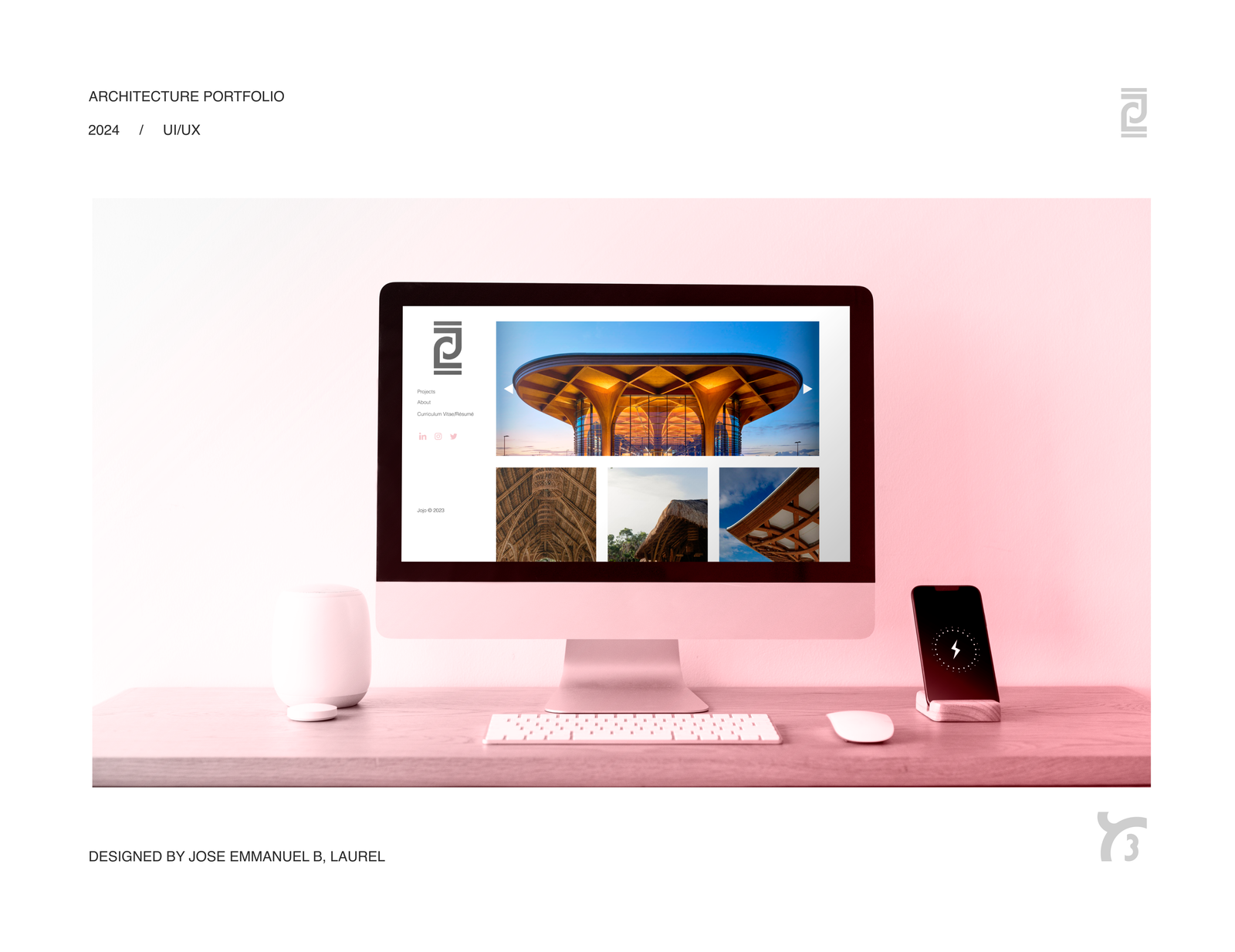

What if you could scroll through a portfolio, say nothing, and still understand everything?
That’s what this project asked of me: a visual experience for a junior architect where the work said it all — no captions, no copy-heavy case studies. The intended audience? Architecture firms and senior designers used to flipping through portfolios quickly, instinctively. I had to respect that — and design for it.
But I also had to keep my client in mind. They needed a site they could update themselves on WordPress, built with Elementor, with just a touch of coding magic (mostly for image parallax effects). Balancing the client’s creative vision with technical practicality became the heart of this UX journey.
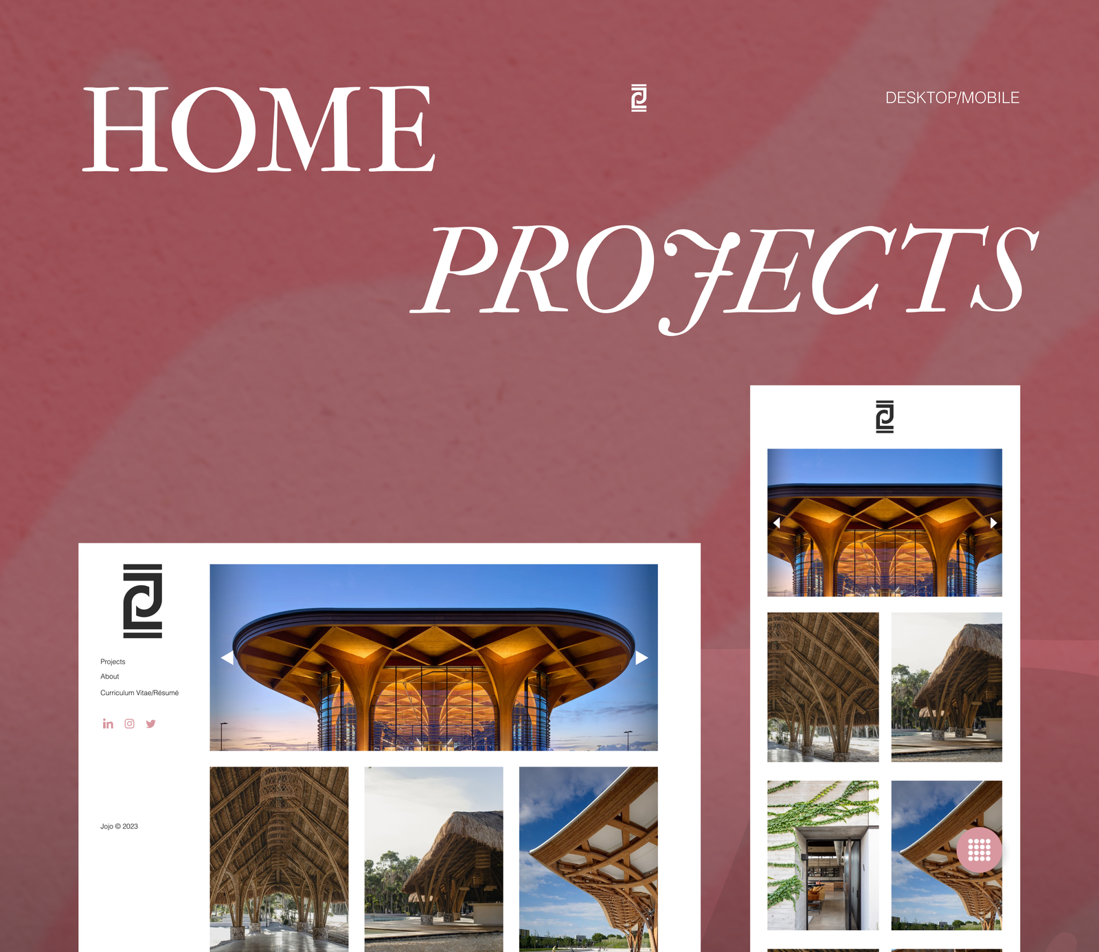
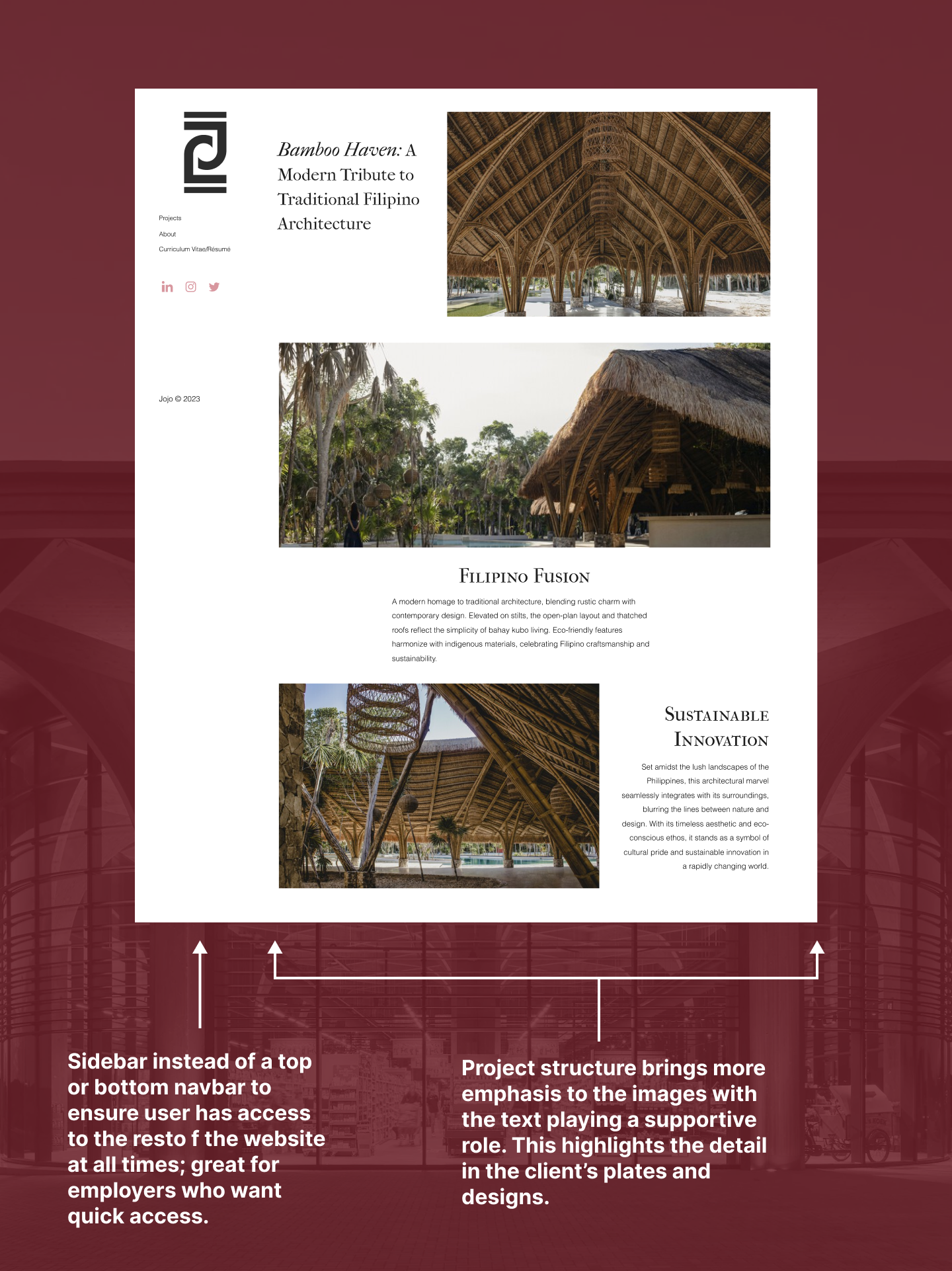
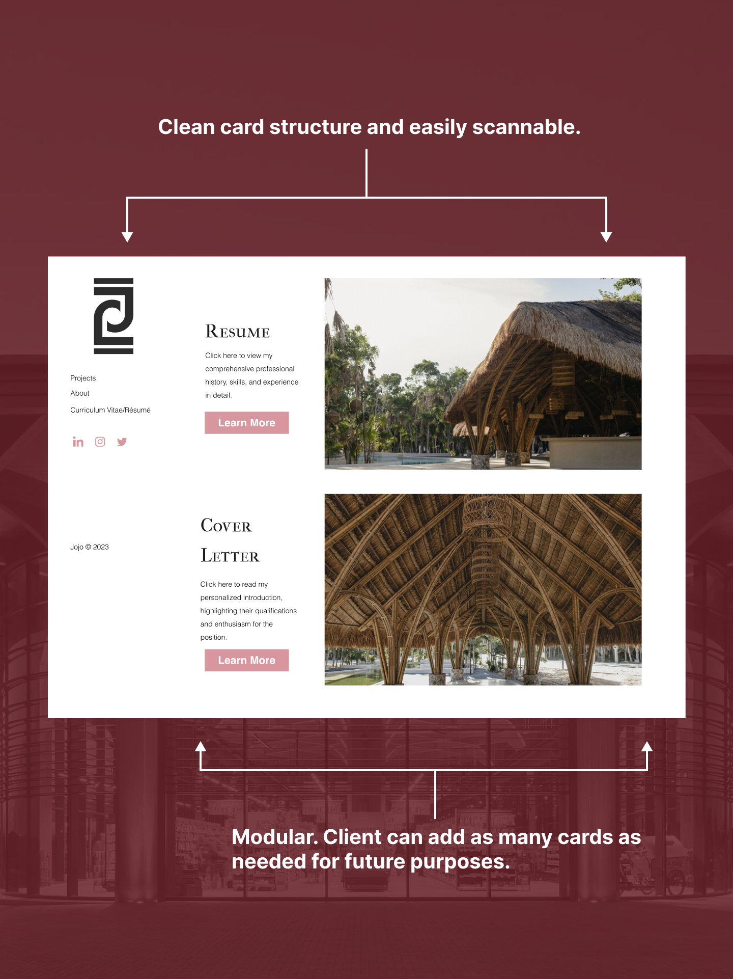
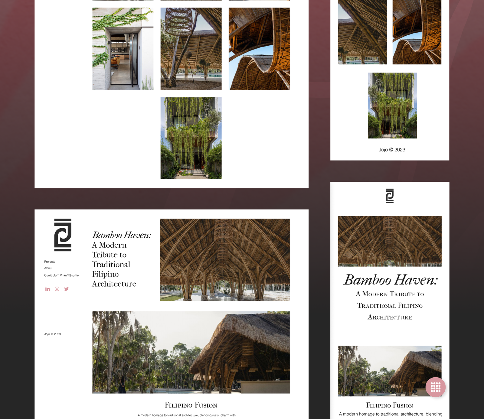
I started with the bones — a clean grid system that mirrors architectural logic. Every section breathes. Whitespace wasn’t a luxury here — it was part of the identity.
Subtle parallax effects brought a sense of depth, implemented via lightweight code that wouldn’t break Elementor’s live editing. Instead of flashy animations, I focused on gentle transitions and image priority.
The About page is short, straightforward, and welcoming.
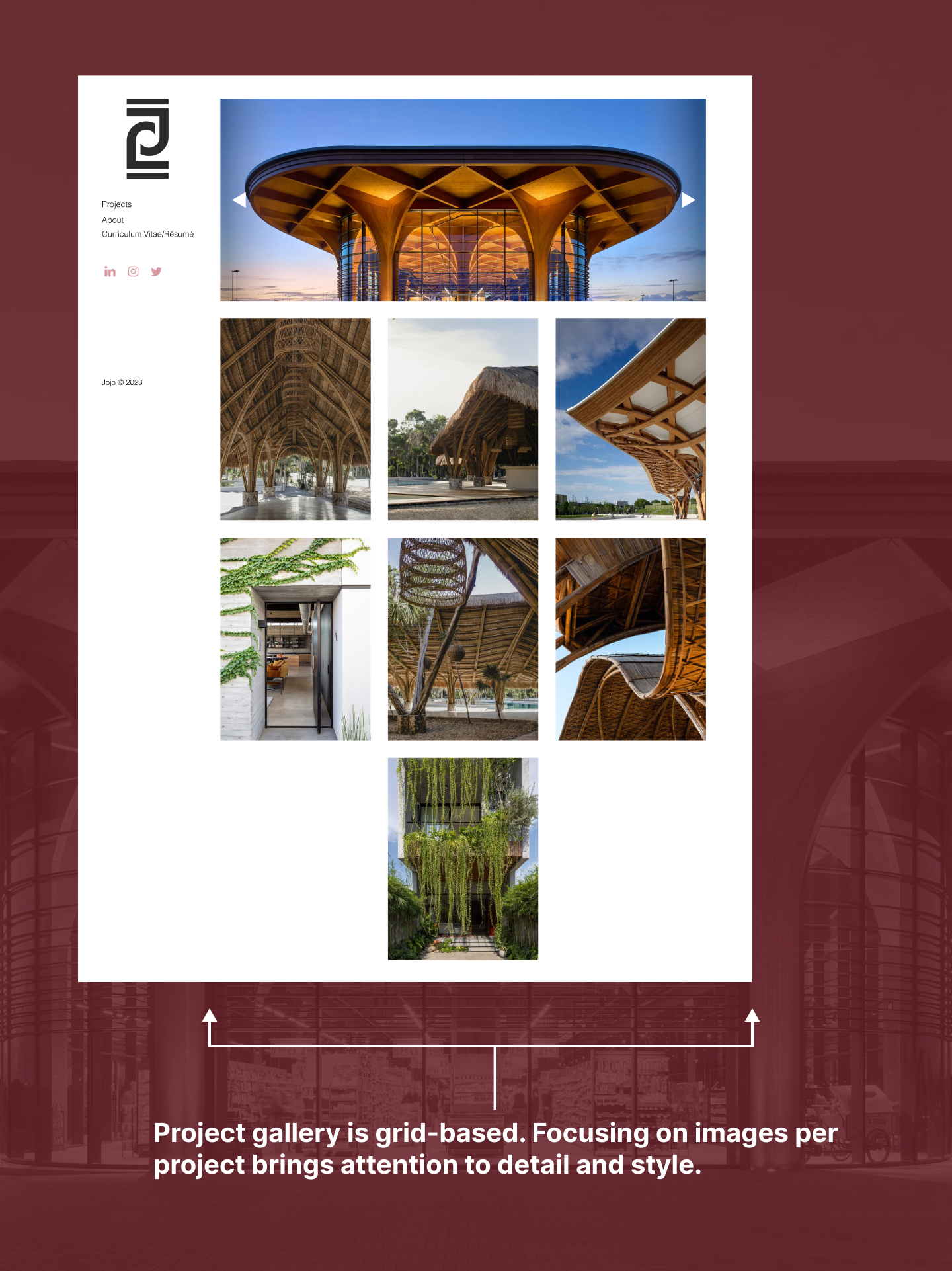
The Project Gallery is text-free by design. No overlays. No clutter. Just curated images, each optimized for clarity and distinction. A hover-reactive custom cursor quietly helps users know where they are, enhancing interaction without disturbing the aesthetic.
Challenge 1: Minimal Text, Maximum Clarity
No project titles. No blurbs. Just images. That meant:
Contrast and structure became my tools for intuitive navigation.
Challenge 2: A Disjointed Timeline
Due to shifting priorities and changing times, both our schedules were disjointed and our meetings inconsistent regarding the development of the website. So I:
They appreciated the flexibility — and felt guided without being rushed.
In the end, we delivered a portfolio that matched the rhythm of its field: clean, focused, and confidently understated. The client was proud. The employers it targeted? Likely felt right at home.
And for me, it was a masterclass in how less really can be more — if you design with intention.
This project taught me a lot about silent communication — not just in visuals, but in collaboration.
If I could go back:
I’d also prep tutorial mini-guides for my client, so updating content would feel even easier. Because handing off a site is just as important as designing it.
Don’t miss the chance to get a website that truly represents you! Choose a template that suits you or schedule a meeting for a custom design that fits your budget!
Get newsletter update for upcoming product and the best discount for all item
Products
@ 2024 Ang Wika Natin
Effective Date: November 7, 2024
Welcome to Ang Wika Natin. By accessing our website or purchasing our products, you agree to be bound by these terms and conditions.
1. Overview
Ang Wika Natin offers WordPress templates, physical and digital art, stickers, custom website services, and financial advising. These terms govern your use of our services and products.
2. Intellectual Property
All content, designs, and materials on this website, including templates, art, and code, are the property of Ang Wika Natin and are protected by intellectual property laws. You may not reproduce, redistribute, or alter any product without permission.
3. Product Use and Licensing
Purchasing our digital templates or custom websites grants you a limited, non-transferable license to use the product solely for personal or business use. Redistribution or resale is strictly prohibited.
4. Refund and Return Policy
5. Financial Advising Disclaimer
Financial advice provided on this website or through consultations is for general informational purposes and does not constitute personal financial planning. Please consult with a licensed financial planner for tailored advice.
6. Limitation of Liability
Ang Wika Natin is not liable for any direct or indirect damages arising from the use of our products, services, or website, including loss of data or profit.
7. Modifications to Terms
We reserve the right to update these terms at any time. Changes will be effective immediately upon posting to this page.
For any questions, please contact us at joselaurelemmanuellaurel@gmail.com.
Effective Date: November 7, 2024
At Ang Wika Natin, we value your privacy. This policy outlines how we collect, use, and protect your personal data.
1. Information We Collect
We may collect information such as:
Personal Information: Name, email address, and billing information when you make a purchase.
Usage Data: Data about your interaction with our website, including IP addresses, browser types, and cookie information.
2. How We Use Your Information
Order Processing: To process and fulfill purchases, send confirmations, and communicate with you.
Marketing: To send you updates about new products or services, if you’ve opted in.
Analytics: To improve our website and services by understanding user interactions.
3. Sharing Your Information
We do not sell or trade your information. We may share data with trusted third-party services that assist us in operating our website (e.g., payment processors).
4. Data Security
We implement security measures to protect your information from unauthorized access or disclosure. However, no method is completely secure, and we cannot guarantee absolute security.
5. Your Rights
You have the right to request access to, correction of, or deletion of your personal data. Contact us at joselaurelemmanuellaurel@gmail.com for assistance.
6. Changes to Privacy Policy
We may update this policy. Any changes will be posted on this page with the effective date.
Effective Date: November 7, 2024
Ang Wika Natin uses cookies to enhance your experience and analyze site traffic.
1. What are Cookies?
Cookies are small data files stored on your device that help us understand user behavior and improve our website.
2. Types of Cookies We Use
Essential Cookies: Required for website functionality.
Performance Cookies: Used for analyzing site usage and improving performance.
Marketing Cookies: Used to deliver relevant content or advertisements if you’ve opted in.
3. Managing Cookies
You can control cookies through your browser settings. Note that disabling cookies may affect site functionality.